cs.02 · 2023 ✳ case study
Building Trust in Agricultural Payments
Reduced payment time by 85% and cut errors by 50% on a $500M+ financial platform by redesigning complex payment flows into a clear, trustworthy experience.
- Fintech
- Payment Flows
- Enterprise SaaS
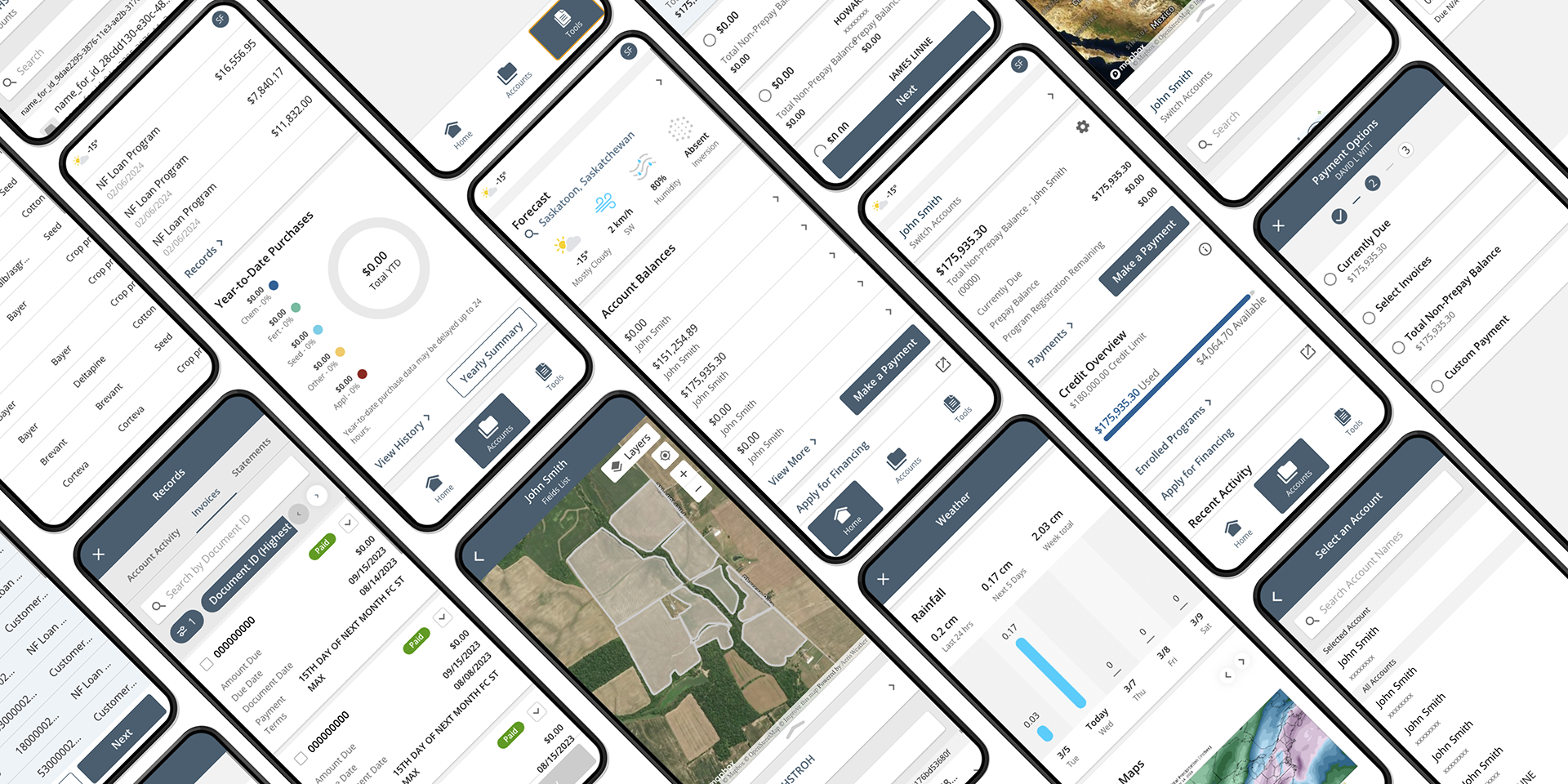
fig. 01 · discovery
When payments feel risky, people avoid them
Nutrien's agricultural customers manage complex finances. Balances, invoices, and payment schedules tied to seasonal cycles and fluctuating costs. The company processes over $500 million in annual payments through these relationships. But the digital payment experience wasn't working.
Payments took over 6 minutes to complete. The error rate for online payments was 15%, but only 10% of customers were paying online at all. Most preferred to bring checks directly to their crop consultant. That's how much they trusted people over the system.
The digital hub wasn't earning that trust. In an early usability test with 5 customers, I found they weren't abandoning online payments because the interface was slow or ugly. They were abandoning because they didn't understand what they owed or why. Balances were fragmented across multiple screens. Due dates were unclear. Customers couldn't tell if they were paying the right amount, so they defaulted to the safest option. Handing a check to someone they trusted.
The problem wasn't interaction design. It was confidence.
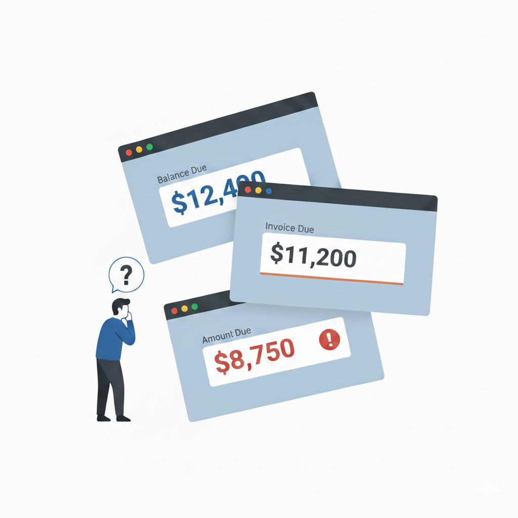
fig. 02 · insight
Clarity over clicks
Traditional UX thinking would focus on reducing clicks, enlarging buttons, streamlining the flow. But our usability testing revealed something different. Users didn't need fewer steps. They needed to understand each step.
The breakthrough was simple. Create a single current balance, like a credit card statement, with one clear amount and one due date. Then show exactly how that number was calculated by letting customers view the invoices and charges that added up to the total. When users could see the math, they trusted the number. When they trusted the number, they completed the payment with confidence.
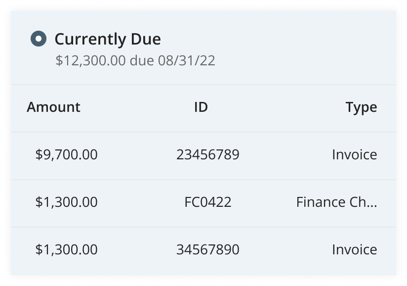
fig. 03 · approach
Aligning a product trio through constant change
This was my first time working in the product trio model, with design, product, and engineering aligned throughout development. Early on, alignment was breaking down.
The biggest challenge was data. Nutrien has massive amounts of agronomic and financial data, but it wasn't always accessible when we needed it. Requirements shifted as data teams worked through technical constraints. Assumptions we made in design would change mid-sprint when we learned certain data couldn't be surfaced.
I took the initiative to create structure around this uncertainty. I established weekly trio syncs with my PM and engineering lead to catch misalignment early, and I shared the clarity insight with both of them so we could align on a new design principle. Every decision had to answer one question. Does this help the user feel confident they're doing the right thing? Status indicators, clear descriptions, and visible calculations all stemmed from this principle.
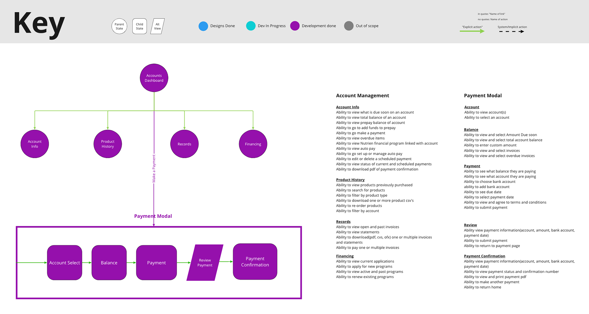
One artifact kept our product trio aligned
I created and managed a dynamic model with my PM and engineering lead. A hybrid of a user flow and requirements tracker that let us outline all requirements and organize them into an intuitive information architecture in one view. The dynamic model became the engineering team's source of truth for visualizing the system and tracking progress. I used it as a template to start wireframing. Our engineering lead used it to write Jira tickets. When requirements shifted, we updated the model together so everyone stayed aligned.
Learning to leverage a design system
This was also my first project working with an extensive design system. I partnered with our design system team to understand component capabilities and constraints. Initially it felt like a constraint because my ideas never fit perfectly into existing components. But over time, my thinking shifted from "how do I make this work with components?" to "which components can I leverage to solve this problem?" That mindset change made me faster and more consistent, and meant our engineers could build more efficiently because they were working with familiar patterns.
fig. 04 · solution
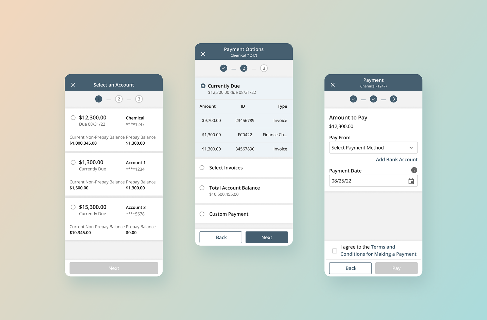
The payment flow: building trust through transparency
I restructured the payment flow around the clarity principle, using a stepper pattern to reduce cognitive load and ensure users focused on one decision at a time. The flow breaks into three steps.
Step 1: Choose your account
Users see all their accounts sorted by due date, with the most urgent payments surfaced first. The currently due amount is the most prominent information on each card, so users immediately understand what needs attention.
Step 2: Select your balance
This is where transparency matters most. We default to the currently due amount, similar to a credit card statement balance, and show all the transactions that make up the total. Users can see exactly how the number was calculated. For accounts with more than five transactions, a "show more" option keeps the interface clean while still providing full visibility when needed.
Step 3: Confirm payment details
Users select their payment account and date. By this point, they've already seen what they owe and why, so the final step is just confirmation.
This structure transformed a confusing 6-minute process into a 55-second flow. The stepper kept users oriented, the transparency built confidence, and defaulting to the currently due amount guided users toward the right choice without forcing them to figure it out themselves.
A trade-off that didn't make the cut
We originally wanted to remove the review screen entirely and replace it with a 5-minute undo window after payment submission. This would reduce a click while still giving users a safety net.
But our engineering lead flagged that the technical lift was significant, and when we tested the concept, users didn't understand it. The undo window created more anxiety, not less. They wanted to review before submitting, not after. We cut the feature and kept the review screen. Sometimes the simpler solution is the right one.
Beyond payments: the trust principle scaled
The same clarity principle shaped a unified financial dashboard I designed alongside the payment flow. It consolidated balances, records, and purchase history into one place, replacing a fragmented experience that forced users to hunt for information across multiple screens. Feedback from our usability test highlighted the same response we saw on payments. When users could see what they needed clearly, they trusted what they were looking at.
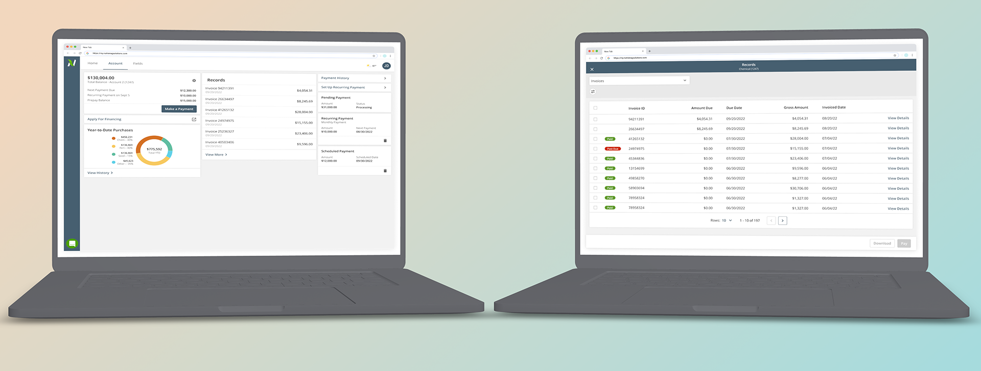
fig. 05 · impact
When users trust the system, they use it
The results validated the clarity-first approach.
- 85% reduction in average payment completion time (6 minutes to 55 seconds)
- 50% reduction in payment errors
- 2x increase in digital payments within the first year, as customers shifted from handing checks to consultants to paying online
- 90% satisfaction score after the redesign
We didn't just make payments faster. We made customers confident enough to stop bringing checks to their consultants and start trusting the digital experience.
fig. 06 · reflection
Clarity builds trust
The biggest lesson from this project wasn't about payment flows or design systems. It was about what actually earns user trust.
I came in thinking the problem was friction. Too many steps, too many clicks, too much time. But the real problem was uncertainty. Users didn't trust the numbers they were seeing, so no amount of streamlining would make them confident enough to complete the payment. The solution wasn't fewer clicks. It was showing the math.
I've carried this principle into every project since. Before optimizing for speed, make sure users understand what they're doing and why. Confidence comes from clarity, not convenience.
more work
← previous case
Matching Enterprise Tools to Field-First Work
60% faster order creation · 2x transaction volume · 4 product squads · 10,000+ users
next case →
Interactive Design System Onboarding
10 designers onboarded · Scaled to PM + Engineering · Org-wide standard
© 2026 Damean Rittmann ✳ Designed & built by hand (and a little AI)
Back to top ↑