cs.03 · 2024 ✳ case study
Interactive Design System Onboarding
Created the organization's first interactive design system training. Scaled adoption from the design team to product and engineering functions where it became the standard onboarding resource.
- Design Systems
- Internal Tools
- Onboarding UX
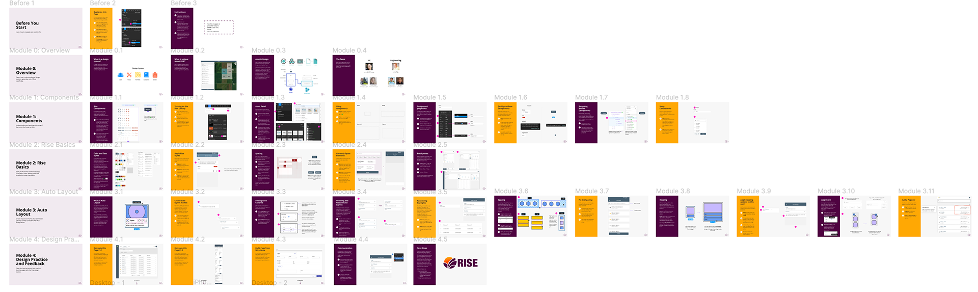
fig. 01 · discovery
A problem the team had decided not to solve
While working with Nutrien's design system team on a broader system redesign, I led the synthesis of a service blueprint from conversations with multiple product teams. The blueprint surfaced five takeaways, but one stood out as both common and underserved. Designers across the organization didn't fully understand the design system's principles, components, or documentation. Onboarding to the system was inconsistent, slow, and mostly self-directed.
The team had decided to deprioritize the problem. Not because it didn't matter, but because the bigger system redesign was already consuming bandwidth. I disagreed with the call. The problem was high-impact and could be solved with minimal investment. I made the case to my manager, got backing, and took it on as a side project.
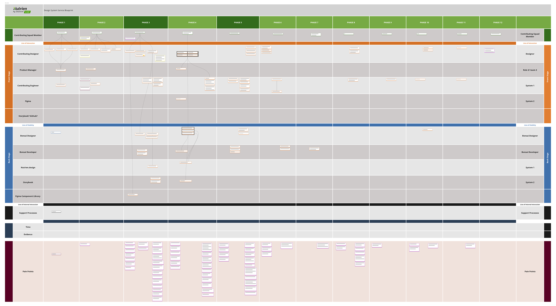
fig. 02 · insight
Learn the system by using the system
Most design system onboarding assumes designers will read documentation and absorb principles. That's the slow path. Educational psychology research on learning retention is clear. People learn faster and remember longer when they practice what they're learning, not when they read about it.
The reframe was simple. Onboarding shouldn't teach designers about the system. It should put them inside the system, working with real components, solving real problems, recreating real screens. Hands-on practice would build muscle memory in a way documentation never could.
fig. 03 · approach
Figma as the classroom
I chose Figma as the platform because it was already the team's primary design tool, which meant zero adoption friction. More importantly, Figma's interactive capabilities let me build practice scenarios that mirrored real design work, not abstract exercises.
I worked with another designer to audit existing materials, research how other design systems handled onboarding, and build a comprehensive list of learning objectives. We used a value matrix to rank objectives by value and effort, which gave us a focused outline for the first version rather than trying to cover everything.
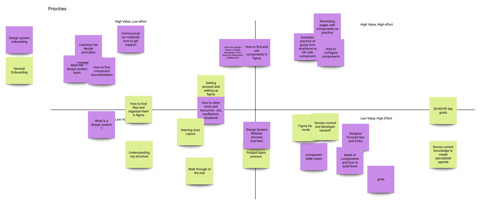
The structure paired every informational slide with a hands-on task that reinforced the material. Practice scenarios pulled from real examples in our application, so designers were solving authentic problems and recreating actual pages, not toy exercises. Distinct color schemes signaled when designers were in interactive mode versus reading mode, making the file easy to navigate.
An early round of feedback surfaced something I hadn't anticipated. The file itself needed onboarding. Designers weren't sure how to duplicate it, navigate between modules, or work inside it without breaking the structure. I added a "before you start" section covering the basics, which improved the experience significantly. A small reminder that even good onboarding products need their own onboarding.
fig. 04 · solution
Five modules, built around doing
The final file comprised five modules covering design principles, components, and foundations. Each topic built progressively on the last. Most informational content was followed immediately by an interactive task, so designers could test their understanding before moving on.
I included a module on auto-layout that wasn't strictly part of the design system but was essential to how our application was built. It gave designers tips that would streamline their day-to-day work, not just their design system work. The final module focused on design practice. Designers recreated simple screens from our application in Figma and were guided through the process of soliciting feedback from the design system team to ensure pixel-perfect accuracy.
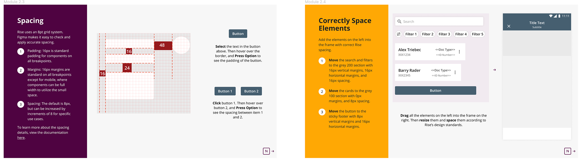
fig. 05 · impact
From side project to org-wide standard
The file shipped to the design team and was adopted immediately. Two new designers used it, and all 10 existing designers went back through it to refresh their own skills. Leadership saw the impact and expanded the approach beyond design. Versions of the interactive onboarding pattern were adopted across product management and engineering, making me the pioneer of the organization's primary design system onboarding resource.
The cost was a few weeks of focused work on a side project. The return was a scaled training resource adopted across multiple functions. Sometimes the highest-leverage work is the work nobody asked you to do.
fig. 06 · reflection
Onboarding is a design problem, not a documentation problem
The biggest lesson from this project wasn't about Figma or design systems. It was about how learning actually happens. We invest enormous effort in making products intuitive for users, then assume our internal teams can self-teach from documentation. They can't, and they shouldn't have to. Onboarding deserves the same design rigor as the products themselves.
I've carried two principles forward from this work. First, when I see a high-impact problem the team has deprioritized, I make the case for it rather than waiting for permission. Second, when I'm teaching anything, I default to hands-on practice over passive content. People learn by doing.
more work
← previous case
Building Trust in Agricultural Payments
85% faster payments · 50% fewer errors · 2x digital adoption · $500M+ platform
next case →
Matching Enterprise Tools to Field-First Work
60% faster order creation · 2x transaction volume · 4 product squads · 10,000+ users
© 2026 Damean Rittmann ✳ Designed & built by hand (and a little AI)
Back to top ↑